Color Panel
HSB Color Picker
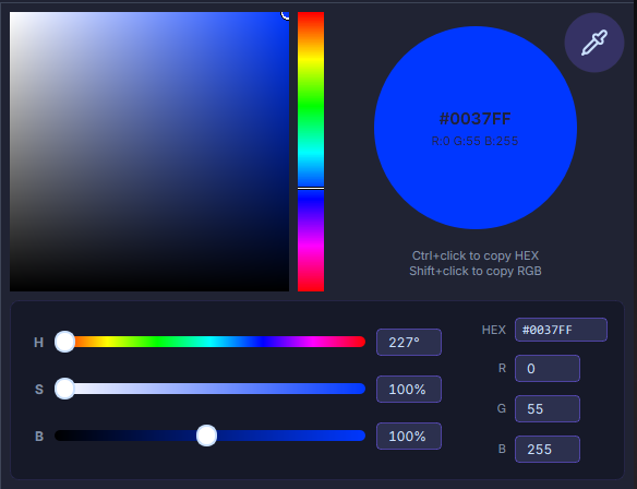
Selecting Colors Using the HSB Model
The HSB model defines colors through Hue (color type), Saturation (color intensity), and Brightness (lightness/darkness).
Select H (Hue) in the color picker.
Enter a value between 0° and 360° in the H text field.
Adjust saturation and brightness using the following methods:
- Click to select a color block in the color area,
- Drag the circular marker, or
- Enter values in the S and B text fields.
Selecting Colors Using the RGB Model
The RGB model mixes red, green, and blue light to produce the desired color variations.
Enter values in the range of 0 to 255 in the R, G, and B text fields.
You can also select a point in the color area, which displays the blending effect of the two unselected RGB components.
Selecting Colors by Specifying a Hexadecimal Value
A hexadecimal (hex) value is a 6-digit code representing an RGB color value, commonly used in web and digital design.
Eyedropper Button
Pick a color from any position on the screen, displayed in real-time in the color picker. Left-click to pick, right-click to exit.
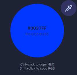
Color Preview
Preview the currently picked or selected color, displaying both HEX and RGB values. Ctrl+Left-click to copy HEX, Shift+Left-click to copy RGB.
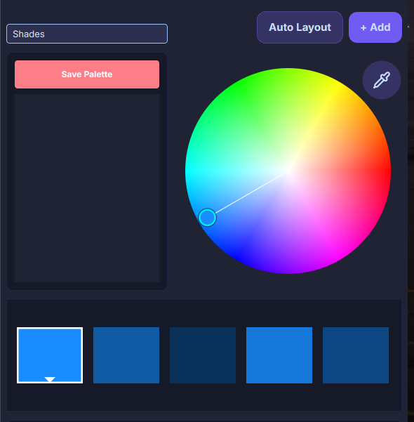
Color Wheel
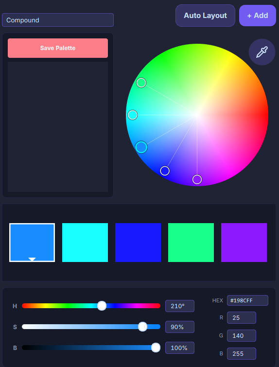
Color Rule List
The color wheel uses preset rules based on color theory to intuitively help you choose color combinations. You can also create custom color combinations directly from the color wheel without any rule restrictions. Color rules are applied based on your selected base color.
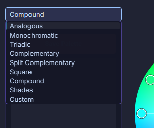
Rule Examples
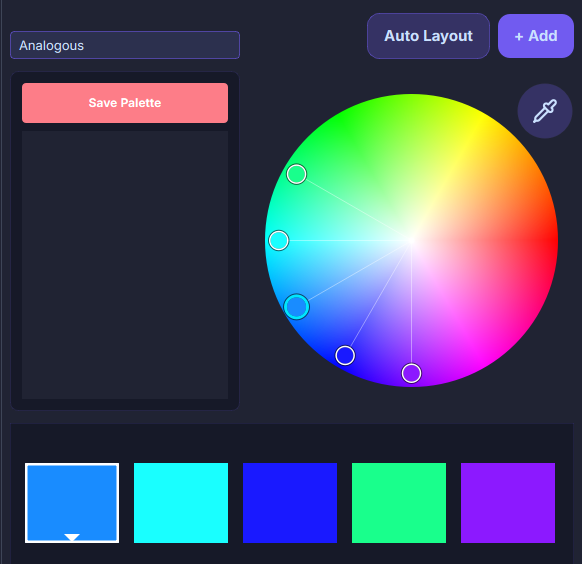
Analogous
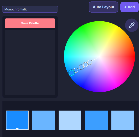
Monochromatic
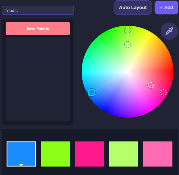
Triadic
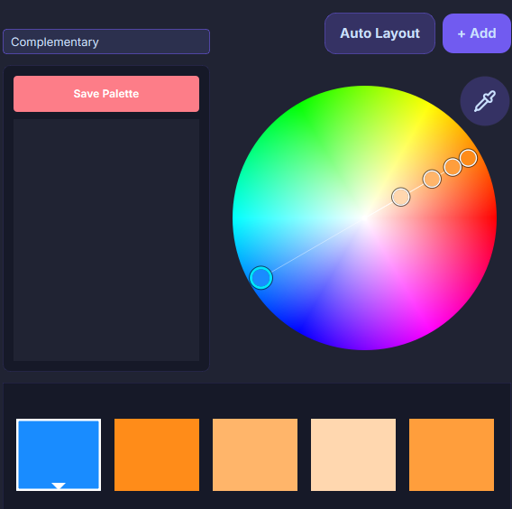
Complementary
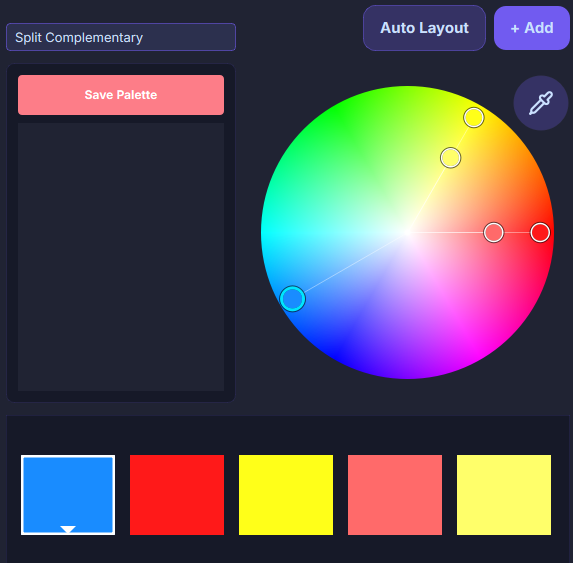
Split Complementary
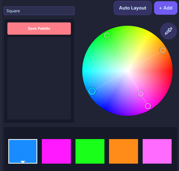
Square
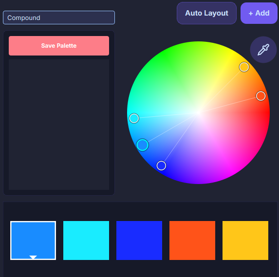
Compound
Shades
Auto-Arrange Button
Reset the positions of nodes on the color wheel based on the current primary color and selected color rule.
Add Button
Add a color to both the wheel and the color preview area simultaneously. If a rule is selected (not Custom), the added node will be automatically positioned on the wheel according to the rule.
Up to 12 nodes can be added.
Eyedropper
Pick a color for the primary node among the nodes on the wheel. You can pick a color from any position on the screen. Left-click to pick, right-click to exit.
Color Preview Area
The colors of the nodes on the wheel are previewed in this area.
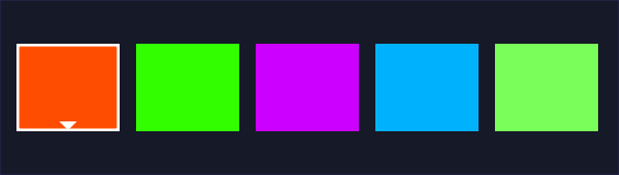
- The one with an arrow is the color preview of the primary node.
- Click to select a color block. Double-click any color block to make it the primary node; other blocks will automatically adjust according to the rule.
- Hold Ctrl and left-click any color block to copy its HEX value. Hold Shift and left-click any color block to copy its RGB value.
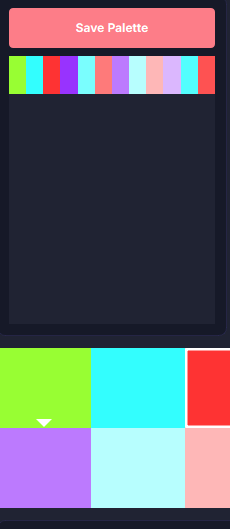
Save to Spare Color Group Button
Temporarily save the color combination from the color preview area below into a list for reference. Double-click a combination in the list to restore its colors in the color preview area.